Monday, 23 January 2012
Style Of Magazine
My magazine will be an indie rock magazine that covers a large amount on niche artists whilst also covering the hottest new talents in the genre world. It aims to advertise small bands making their way through the music industry whilst creating informal reader friendly humorous articles, which make the target audience much more interested and comfortable with the magazine.



Thursday, 19 January 2012


Friday, 13 January 2012

Tuesday, 10 January 2012
Magazine Inspiration - Front Covers

Huck
I like this front cover, because the magazine has allot of white space and is very simplistic. This makes the magazine easy to read and to understand, comforting the traget audience. The Mathshead is in lower case, so its allot more relaxing and informal whilst the large image has a sepia tone, which relates to the target audeince, of retro californian skateboarding.

RollingStone
This magazine is influencial to me because it sell's itself to a slightly different audience through the image. As Rolingstone is an iconic font and name, people do not need to say the whole mathshead to know what the magazine is about, therefore putting this artist of a slightly different music genre on, intrege's a new audience. I particular like the line of symmetery that runs through the centre of the peice, which makes the text stand out from the background.

WIRED
I like the use of colours on this front page because it makes the magazine stand out and with the rest of the colours being black, white and grey, it attract the audience, and makes the writing inside stand out, which in this case is the headline (main story) of the magazine. It also uses these bright colours (cyan, magenta, yellow and green) within the text (sub headings) which colour specific text to make it stand out, so these words highlight an important part in the magazine.

NME
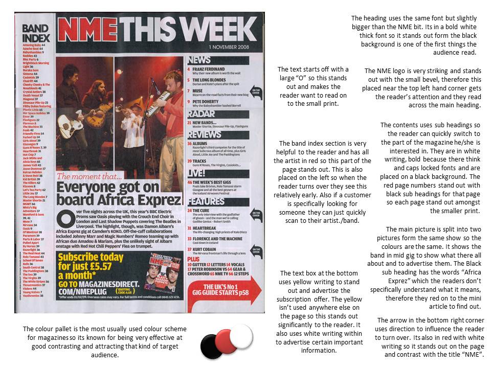
I really like the contrast of colours on this magazine front cover, as the red stands out on both black and white layers behind them, and the white stands out on a black background, which in this case is the image of the two musicians, which is placed to the right. I also like this magazine because it uses the 'F' layout which has bold capital text sub-headings, to intrege the reader. It also uses a qoute, which stands out under the headline, which incopperates a joke, which the traget audience would understand, therefore related to the reader. I think this is a very clever technique which intrege's the target market to red on because they feel the magazine suites them.
Monday, 9 January 2012
Analysis Of Magazines - Glossary
Masthead – The name and logo of the magazine.
The Lead – the introductory paragraph of an article. Usually written in bold or capitals.
Body copy - refers to the text of your written articles, which should be produced as a printed presentation to accepted industry standards, e.g. correct use of language, font size, word limits etc. Usually written in columns.
Serif font – fonts like Times New Roman, or Baskerville Old Face, which have little bars (serifs) on the end of the letters.
Sans serif font – fonts like Impact, or Agency FB, which do not have little bars (serifs) on the end of the letters.
Drop Capitals – Really big letter, which start off an article.
Cross Head – Small sub-heading used to split up a large block of text.
White Space – white parts of a page other than text or pictures.
Mode Of Address – How the magazine talks to the audience.
Sell Lines – Text on the cover that helps to sell the magazine to the audience. Kerrang!’s sell line is “life is loud”.
Banners – text, which stands out because its on a coloured background.
House Style – a magazines distinctive design that distinguishes it from its competitors.
Borders – the gaps at the edges of the page.
Gutters – the gaps between the columns of text.
Leading - the space between lines of text.
Kerning - the space between letters.
Strap Lines – a smaller headline, printed above the main headline.
By-lines - name of the person who wrote the article. Picture Credits - where did the photos come from, or who took them.
Anchorage – The way in which text helps to pin down the meaning of a picture and visa versa.
Subscribe to:
Posts (Atom)